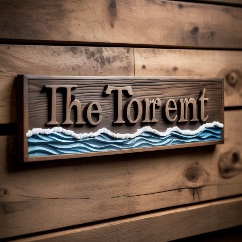
Well, I’m still not settled on how I want the placard to appear on our ship, nor have I been terribly impressed with the sign itself… not in the least! I mean, the ship is absolutely stunning, but so far, the images all look like they were crafted by a child! (No offense meant towards all you little budding Picasso’s)
While I attempt to sort through a boatload of images (notice the nautical reference), I’ve something new that I’ve been working on…
Hugs

This is awesome. You are really talented.
LikeLiked by 1 person
I can’t really take credit for it because my AI program makes it terribly easy, but thank you! Who doesn’t think Nugget’s adorable, and then you add pizza… hehe!
LikeLiked by 2 people
Wow, what program do you use?
LikeLiked by 1 person
Openartai.com
LikeLiked by 1 person
It’s called openartai
LikeLiked by 1 person
Thanks! You do such a great job with your images. I can always tell it’s your blog from the nautical/baby dragon/have a cookie themes. Super creative 🥰
LikeLiked by 1 person
Awww, that’s so sweet! Thank you, love… hugs
LikeLiked by 1 person
I absolutely love this… TOO CUTE …
LikeLiked by 1 person
Thank you so much! Honestly, the program does all the heavy lifting… hugs
LikeLiked by 1 person
So cute! I’m surprised he wasn’t baking cookies 🍪🍪💖
LikeLiked by 1 person
Well…where on the vessel will it be. Traditionally it could be on both sides of the bow, or on the stern quarters. These thing look nice on the transom as well. Lettering has to be easily recognizable from a distance – your font does not make the grade. I also advisse you to soften the ends. Ends, especially on the transom are often ribboned or banner in shape. Rounded ends are common on quarterboards.
A lot of this stuff is actually traditional, but also functional. hard edges and ends might foul lines, so wounded are better. you cn check out my site for samples ot the sites of any of my competitors. ther is plenty of variation, and some examples are downright sexy……well they are if you are a maritime carver.
LikeLiked by 1 person
I think I’m going to do some searching on Google to look for actual images of ships so I have an idea visually of what I’m aiming for, ya know… thank you so much for the suggestions! I knew you’d be familiar… hugs
LikeLike
Too cute! 😊
LikeLiked by 2 people